We flew to New York to celebrate our 10th anniversary and discover the new trends in the city that is always changing (logo included!).
Those who have followed us for a long time (💙) know it: every year we organise a trip for the whole VENTISETTE Digital team, an occasion both to develop the Travel storytelling projects commissioned by our clients and to nurture the professional training and personal research of all the agency’s members.
In fact, while telling stories for brands is part of our work, travelling is our favourite way to gather them, enriching ourselves and the brand strategy we want to build.
VENTISETTE flies to New York
To celebrate our first 10 years, what better gift than New York? The city that — still today — is the quintessential centre of the birth and spread of new global trends in every field, the ideal destination, therefore, to seek out original creative ideas, observe the behaviours of the inhabitants of the “capital of the world”, and discover trends still unseen in Italy but inevitably destined to sweep over us in the coming months.
From Williamsburg — our hub during these days and the area that, together with the entire borough of Brooklyn, saw the birth of many of the subcultures that later became mainstream all over the world (does hipsterism ring a bell?) — to the historic neighbourhoods of Manhattan, protagonists of continuous transformations, the things we noticed are many. And they will be at the heart of our reflections in the coming weeks.
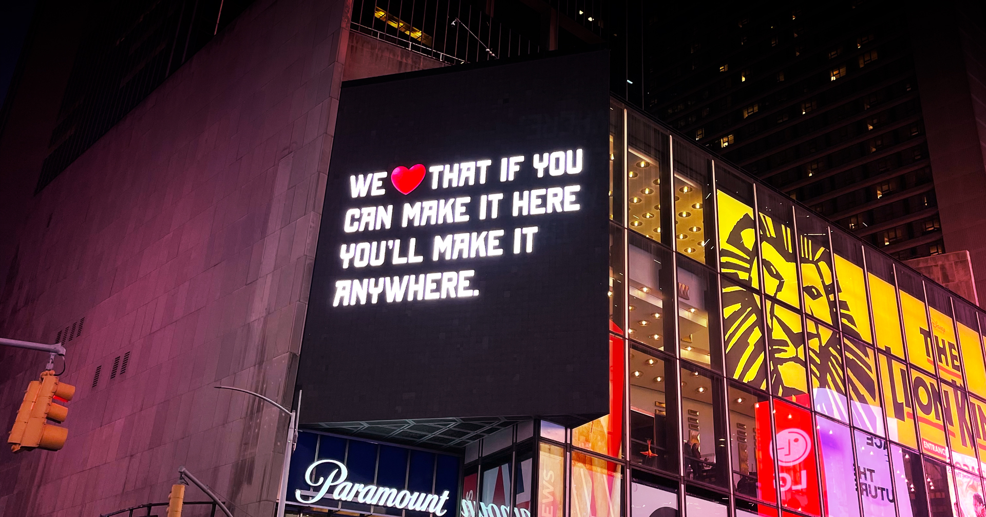
But before pointing you to these in-depth pieces, we can already mention one point — entirely on a communication theme — that struck us immediately, as soon as we set foot in Times Square. On 20 March, the city officially unveiled its new logo, created by art director Graham Clifford: WE ❤️ NYC.
The city’s new logo: WE ❤️ NYC
In the intentions of its promoters (the nonprofit organisation “Partnership for New York City”), the new brand is ideally intended to replace the historic I ❤️ NY designed by Milton Glaser in 1976 to relaunch tourism in the city (which in those years was not shining as it is today, due to Covid, rising crime and widespread decay). A logo that, thanks to its simplicity and the insight of inserting the ❤️ symbol, became a pop icon recognised all over the world, going beyond the city’s borders.
The new campaign, born — as in the 1970s — to respond to a difficult period for the city, has the declared aim of enhancing the sense of community and sharing, overcoming individualism: this is why the pronoun I has been broadened to WE.
What happened, instead, on a purely graphic level? The first thing you notice is the change of font: from an American Typewriter, so characteristic of 1970s editorial design, to a Grotesque Sans, simpler and more modern, an evolution in line with almost all the restylings of historic logos we have seen in recent years, in the name of simplification.
As for the iconic heart, the symbol becomes three-dimensional and very similar to the emoji we use in our chats: a clear desire to adapt to the new digital contexts, which are increasingly predominant (but with the risk, in our opinion, of adding a superfluous “heaviness”).
The arrangement of the elements also changes, spreading out horizontally and placing the heart higher than the logotype. A choice that, in our view, gives a sense of decentralisation to the logo, which loses its square structure but doesn’t acquire a perfectly rectangular one either.
(First) overall verdict?
The drive to renew itself that led to the idea of updating the logo is understandable (and it’s also what animates and makes New York great, in every aspect), as is the social message it conveys (giving value to the community: the city, like all of the United States and the whole world, is increasingly multicultural, and the isolation caused by the pandemic hit everyone hard, particularly in big cities).
But the graphic execution could have been thought through more deeply: working on such an iconic logo is never easy, and controversy is always around the corner (exactly what happened among the majority of New Yorkers), but a solution could have been sought that embraced the new sensibilities without the risk of losing the identity.
Or, perhaps even worse, of providing a proposal destined to be ignored.